case study
Ribas & Ribas Architects
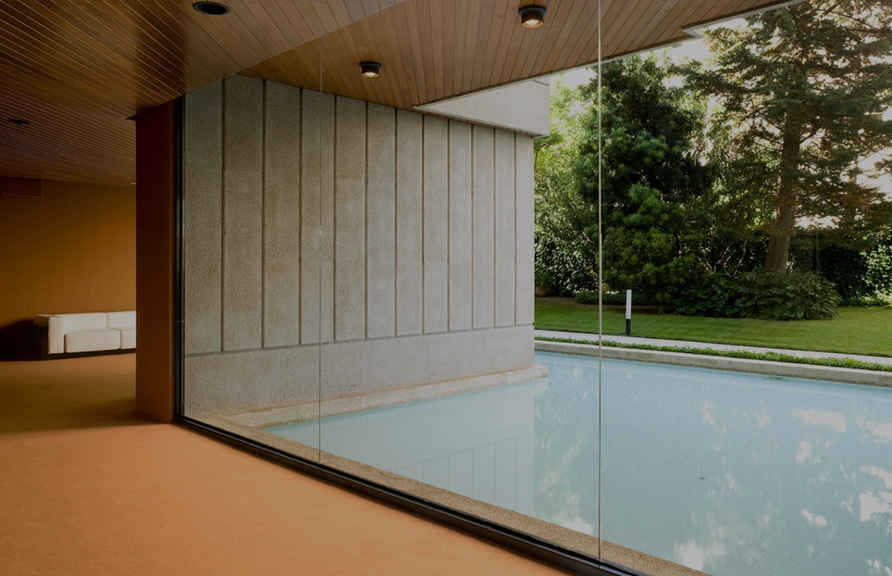
Ribas & Ribas is an architecture studio with more than 70 years of history. Their new website puts the work first: an editorial grid where the projects, not long texts, tell the studio’s story.
Launching soon

- corporate website
- wordpress
- architecture
challenge
Seven decades of work, easy to explore
The studio has projects at every scale, from single-family houses and housing to offices, hotels, schools, urban planning and industrial buildings. The site had to turn that archive into something calm and easy to explore, in three languages: Spanish, English and Catalan.
solution
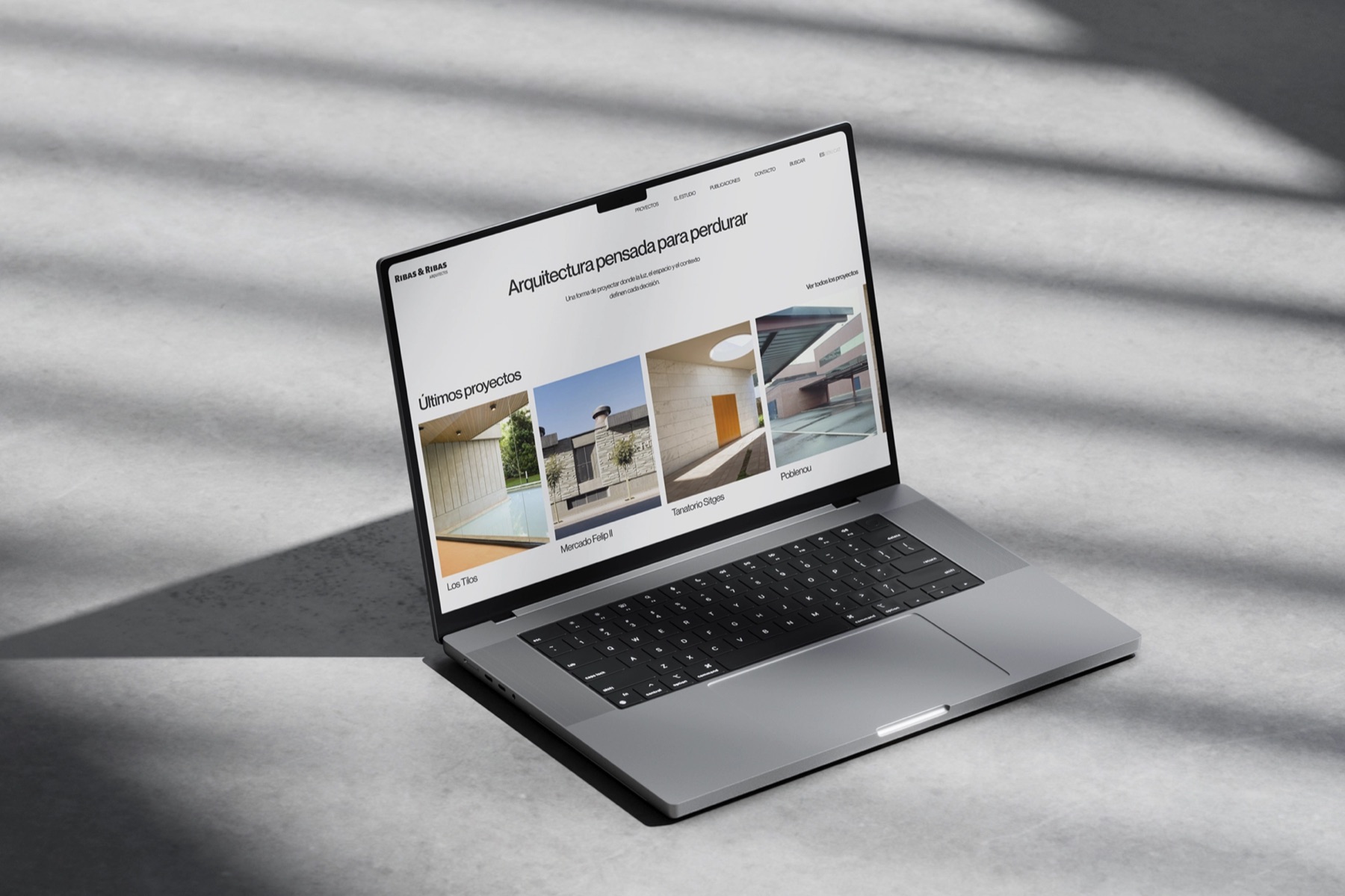
An editorial grid that lets the architecture speak
- 01
Projects index
Filterable by typology, with a grid or list view so it works both for browsing and for finding something specific.
- 02
Project pages
Large photography, a short data sheet with location and year, and related projects to keep exploring.
- 03
A menu with previews
Hovering each typology in the menu shows one of its projects, so navigation already feels like a portfolio.
- 04
Restraint
A six-column grid, one typeface and plenty of white space, so the buildings carry the visual weight.
outcome
A site that ages as well as the buildings
The design and interactive prototypes are finished and the site is being built in WordPress. The system is simple enough for the studio to keep adding projects for years without breaking the layout.